How to Design a Journal & Planner Cover
On a low-content journal or planner, the cover is the product — there's no story, so the cover sells the theme and the use. Winning covers lead with a clear theme (florals, minimalist, motivational, dark academia), carry a large readable title that states the use ('Gratitude Journal', '2026 Planner'), and stay consistent across a series. Skip the author line; the theme is the brand.
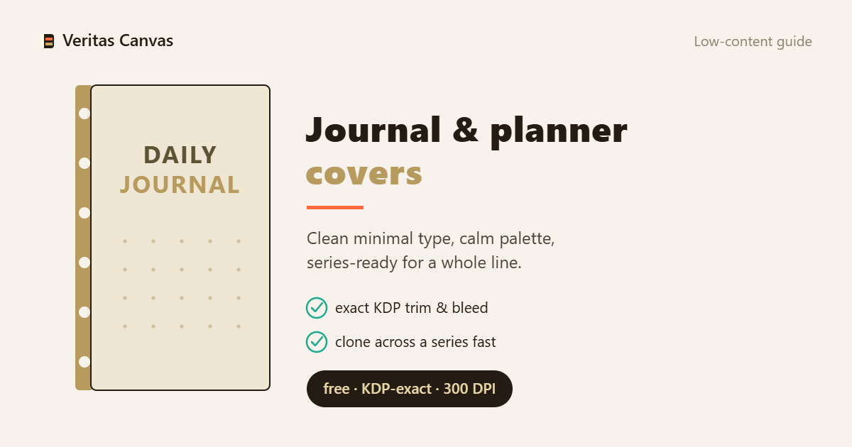
Browse Journal & Planner covers →
The cover is the product
In low-content, the buyer is purchasing the look and the use, not a text — there's no manuscript behind it. So the cover has to state the theme and the function directly: the title should make what it is obvious ('Gratitude Journal', 'Weekly Planner'). Clarity sells, not cleverness; on a shelf of hundreds of similar notebooks, a buyer picks yours for what it's for and which aesthetic it is.
Best-selling journal & planner themes
A handful of themes dominate the shelf: floral/botanical (the widest audience), minimalist/marble (clean, modern), motivational typography (a quote carries the cover), dark academia, and aesthetic/vintage. Pick a specific theme, not a generic 'notebook' — a cover positioned clearly to one narrow aesthetic outsells a blurry one that tries to please everyone.
Typography that states the use
The title says what the book is for: a clear name ('Gratitude Journal', 'Daily Planner') plus a display face that matches the theme. It must read at thumbnail size. The subtitle carries the detail (undated, 120 pages, A5). Here typography isn't just decoration — it's the product label; if it can't be read, the cover isn't doing its job.
Series consistency = a brand
Low-content sells in series. Build one strong template, then swap only the theme/color per variant — same layout, same font system. A recognizable series compounds: when a buyer likes one of your journals, they look for the rest of the line. A consistent series builds a brand where ten scattered one-off covers don't.
Thin spine and the back cover
Journals are often thin — at low page counts the spine can be too narrow to carry text (KDP disallows spine text under ~130 pages), so leave the spine a plain color or pattern. The back can be a simple pattern or a short blurb; keep the barcode zone clear (bottom-right ~2×1.2 in). Match the trim to your interior (6×9, 8.5×11).
Recommended resources
- Amazon — self-publishing guide books
Some links below are affiliate links — at no extra cost to you.