How to Design a Thriller & Crime Book Cover
A thriller cover sells on three signals: a dark, high-contrast palette (near-black plus one accent — blood red, cold blue or amber), bold condensed uppercase type that takes over the cover, and a single ominous image — fog, a lone figure, rain-slick streets. Keep it readable at thumbnail size and simple; genre recognition beats cleverness.
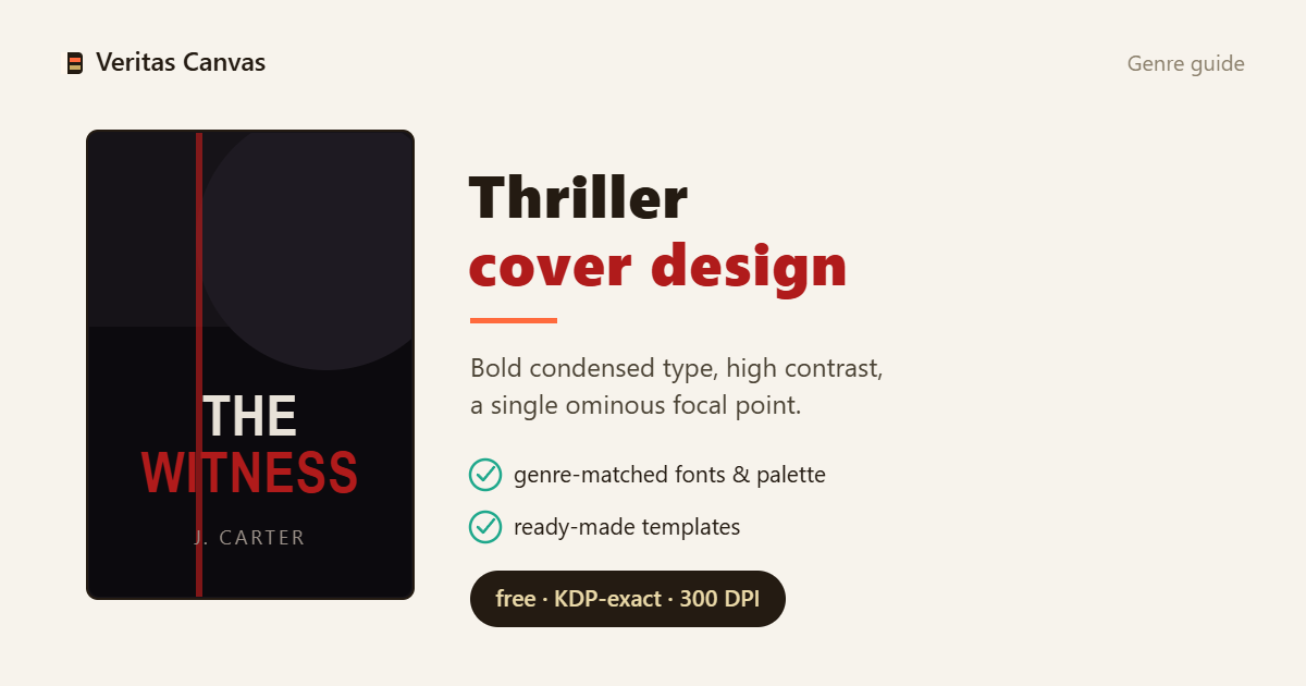
Browse Thriller & Crime covers →
The thriller palette: dark plus one accent
The visual language of suspense is restraint. Start from a near-black or deep-navy base and add one accent: red reads as danger and violence, cold blue as procedural and forensic, amber-gold as noir and classic detective. More than two colors dilutes the tension. Power lives in contrast, not in the number of colors — a single title glowing on a dark ground is more menacing than ten hues.
Typography: big, bold, condensed
A thriller title shouts. Condensed sans faces like Anton, Oswald or Bebas set in uppercase often fill 35–45% of the cover. The title should be the loudest element; the author name sits below, thin and widely tracked, calm by comparison. The rule: enlarge the title, shrink the author line — readers register the genre first, the name second.
Imagery: less is scarier
One strong element beats a busy collage: a silhouette, an empty street, an object that carries meaning. Fog, rain, night and generous negative space build dread. A face half in shadow unsettles more than a crowd. Don't smother the image — a composition that breathes makes the threat feel larger.
Sub-genre signals: crime vs psychological vs domestic
Thriller isn't one shelf. Crime/detective: urban, noir, procedural — a street, a gun silhouette, a forensic detail. Psychological: a single unsettling portrait or object; calm but wrong. Domestic: a house or a family object — with one crack of something off. Match the image to the sub-genre; a reader should know which one it is in a second.
The thumbnail test + best-seller patterns
Amazon shows your cover at stamp size. If the title doesn't read there and the mood doesn't land at a glance, the cover isn't doing its job. Study the top-selling thriller charts: the overwhelming majority are dark, big-type and single-image. That's not a limitation, it's a proven formula — add your own twist on top, but don't break the formula.