How to Design a Sci-Fi & Fantasy Book Cover
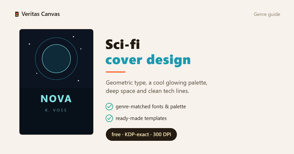
Sci-fi and fantasy covers live or die on typography and scale. Sci-fi leans on clean geometric or wide sans faces (Orbitron, Rajdhani) and cold palettes; fantasy leans on carved serifs (Cinzel, Marcellus) and warm, epic light. In both, the title should feel monumental and stay readable when shrunk to a thumbnail — style the type first, then build the world around it.
Browse Science Fiction covers →
Sci-fi vs fantasy: the font is the genre
The font alone often sets the shelf. Sci-fi: geometric, wide, technical sans (Orbitron, Rajdhani, Audiowide) — future, machine, speed. Fantasy: carved or engraved serifs (Cinzel, Marcellus, Trajan-like) — ancient, epic, magical. The typeface tells the reader which shelf before anything else; don't cross them, a medieval serif on a starship confuses the reader.
Scale and the monumental title
Both genres reward a large, monumental title — letter-spaced caps, sometimes with a metallic or glowing treatment. The title should stand like architecture. But test at thumbnail size: ornate letterforms look magnificent large and turn to mush when small. Monumentality has to be built without breaking readability.
Palettes: cold future vs warm epic
Sci-fi wants cold — deep blue, teal, neon accents, black space. Fantasy wants warm and epic — gold, ember, deep green or purple, dramatic light. The palette builds the world before a single word is read. The wrong temperature (clinical blue on fantasy, pastel on sci-fi) blurs the genre.
Imagery: one epic focal point
Sci-fi: a planet, a lone ship, a neon city, an artifact. Fantasy: a castle silhouette, a mountain, a magical light, an ornate emblem. One epic focal point plus atmosphere beats a cluttered scene. The eye should land in one place, not ten.
Thumbnail readability for ornate type
This is the real trap: engraved serifs and neon glyphs are breathtaking large and vanish small. Amazon shows the cover tiny. Keep the title's key word high-contrast and simple; save the ornamentation for the large view. An epic title that can't be read at stamp size doesn't exist at the point of sale.